
Wednesday
May, 27

How can planning colour contrast between floors and walls help with visibility for older family members?

Featured in:

As eyes age, distinguishing edges and changes in level becomes harder, especially in dim light. When floors and walls are very similar in colour and tone, it can be difficult to see where the wall ends and the floor begins. Steps and small level changes can blend in, increasing the risk of trips and falls.

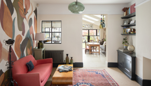
By choosing a floor and wall combination with gentle but clear contrast – say, mid-tone floors with lighter walls, or vice versa – you make room boundaries easier to read at a glance. Skirting boards in a slightly different shade can further highlight edges.

This doesn’t mean using harsh or ugly colour clashes. Even subtle differences in depth and warmth can improve visibility. In hallways, stairs and bathrooms, these small design choices can make movement safer and more confident for older family members or anyone with weaker eyesight.

Latest articles

Related articles

When Your Water Starts Smelling Strange, It’s Probably Trying...

Most of us don’t spend much time thinking about water. We turn on the tap, fill a...

The Quiet Difference Clean Water Makes at Home

Most people don’t spend much time thinking about their water. You turn on the kitchen tap, fill...

Business Junk Disposal Arizona: Smarter Cleanup for Growing Companies

Businesses across Arizona continue adapting to changing customer demands, office expansions, retail upgrades, and warehouse reorganizations. As...

A Home Takes Shape Long Before the Walls Go...

There’s a strange moment that happens during any home project — somewhere between the planning stage and...

Finding the Right Team to Fix Up Your House

The San Jose and greater Bay Area real estate market is incredibly unique. Homes here hold immense...

The Quiet Work Your Home’s Exterior Does (Until It...

There’s something oddly comforting about a home that just… works. You don’t think about the walls, the...