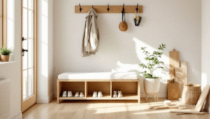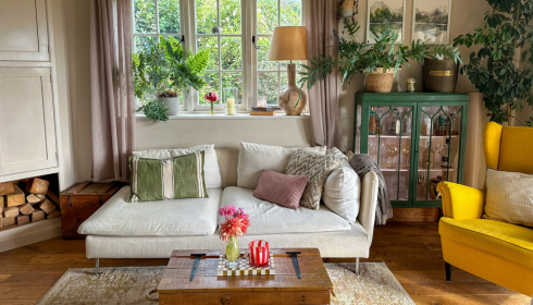
Rooms often feel “messy” not because there’s too much stuff, but because nothing seems to relate to anything else. Colours are scattered at random: one blue cushion, one green vase, one red frame, all competing.
If you pick one colour – say a soft blue, a warm mustard, or a muted green – and let it appear in a few different places, something clicks. A cushion on the sofa, a hint of that shade in artwork, maybe a throw or a candle in the same family. Suddenly, the eye connects those dots and reads the room as a whole, not a collection of unrelated bits.
You don’t have to be perfectly matchy-matchy. Just repeating a tone in three or four spots adds a sense of calm and intention. It’s a simple styling trick that designers use all the time.